PROJECT OVERVIEW
This project focuses on Stukent’s Digital Marketing Simulation. During this simulation, the user is tasked with creating multiple ad types to promote a backpack brand. After they’ve completed certain tasks they can submit their work for results. These results included key metrics that students should pay attention to before going into their next set of tasks.
My team was continually getting feedback from both our users, students and instructors, that these results were confusing. Students didn’t know how to read the results nor did instructors know how to help students improve. Our task was to update these results to make them more intuitive, straightforward, and provide students with actionable feedback.

UX AUDIT
My first step in this project was to get with my Product Manager and conduct a UX audit of the results. This included analyzing how the data was displayed, where students were getting lost, and how the different sections worked together.
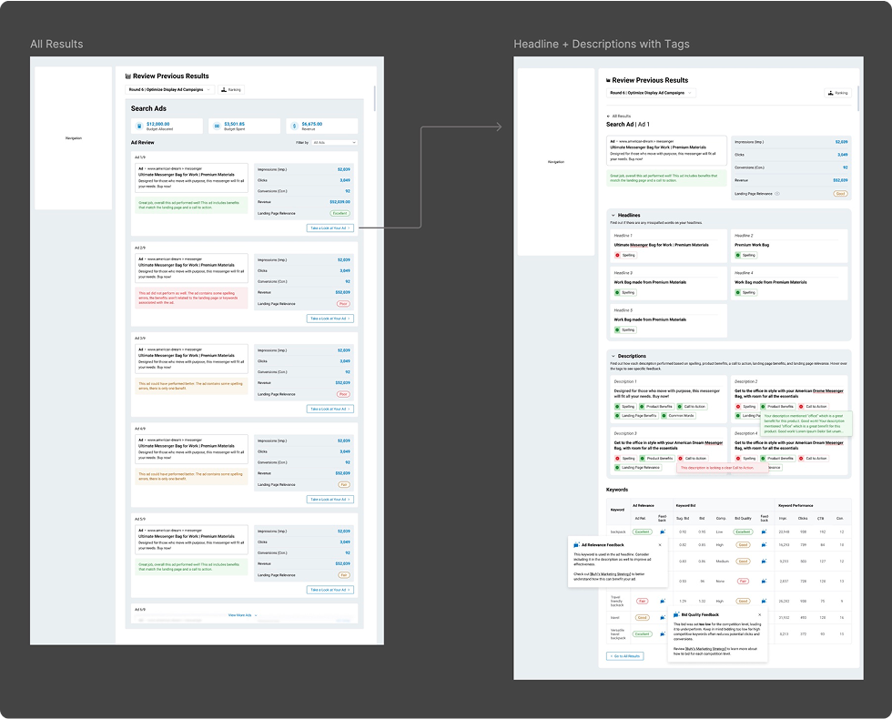
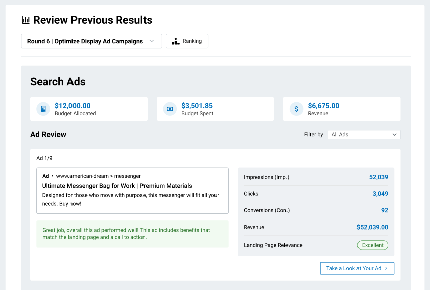
Our findings showed that all the information a student needed was there, but it wasn’t displayed clearly and it was shown differently through the page. Our first task was to create a clear hierarchy for the information.
WIREFRAMING
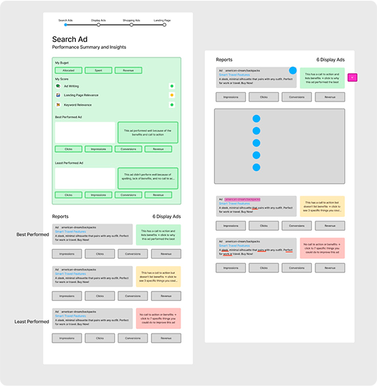
I had this idea two add a subpage into the results. The “main” page would act as an overall summary, while the subpage would act as a way for students to dig deeper into their results. The main page would include all their overall metrics and ads. Then the student could then take a deeper look into their ad and find out specific areas of improvement.
ITERATIONS
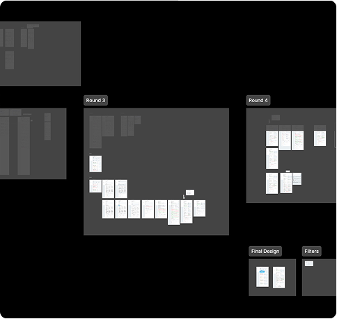
For this project in particular, I reached out to a lot of my fellow designers to get a lot of feedback from them. I wanted to use their experience and feedback because this was such a high profile project. I also coordinated with my Tech Lead because I wasn’t sure how challenging my ideas would be to implement. After about five iterations, I came up with a solution.