Horizon App
Project Overview
This project focused on designing a new platform experience for Stukent’s simulation-based learning products - using the specific simulation Personal Finance. Our product team identified several limitations in the existing system, particularly the lack to intuition before, between, and after simulation activities.
My role was to lead the design of these in between experience to create a more cohesive, guided experience.
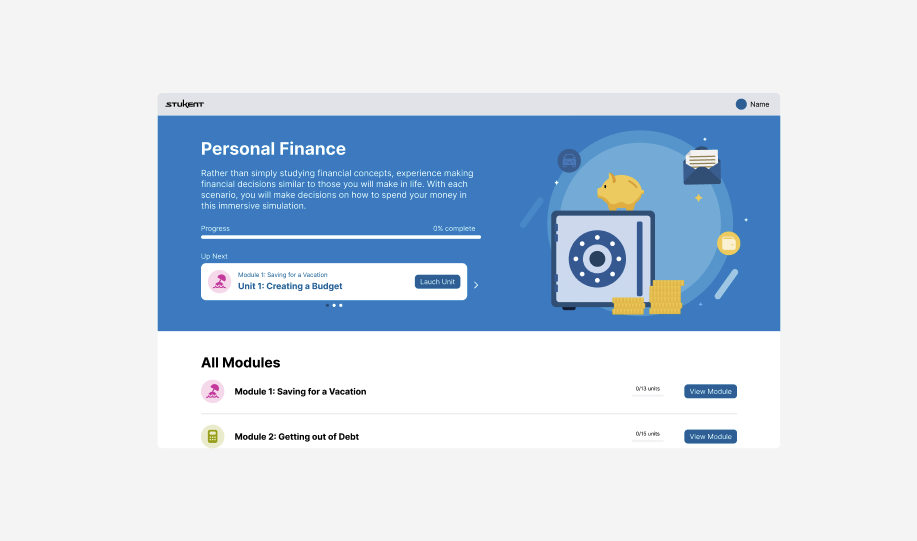
To support this goal, we needed to clarify how users entered and exited the simulation, how they understood their progress, read their results, what happened after the results were viewed, and if we could implement AI into their learning. Although I designed a full set of interactive moments, this case study centers on the landing page experience, which is the primary hub for users to access all modules. The landing page serves as an anchor for navigation, tracking progress, and overall course orientation.
Requirements
My first step was partnering with the Product Manager to define clear, actionable requirements. Because this project introduced major shift in how users navigated Stukent’s simulation, transparent communication and alignment were essential throughout the process.
The core requirements included:
The user needed to have clear and concise descriptions for each module
The user needed outlines associated with each lesson, including learning objectives
The user needed to visually see how they progressed through simulation activities
Research
The research phase combined competitive analysis, visual exploration, and early ideation to understand how modern educational platforms approach course navigation and information hierarchy. I studied learning tools to examine color systems, layout structures, content hierarchy, and visual components used to support comprehension.
Patterns emerged such as dashboard-style layouts with graphs, cards, icons, and imagery to help users orient themselves and stay engaged. Using these insights, I assessed which of these best practices could be adapted to Stukent’s brand which still supporting usability, clarity, and the instructional purpose of the landing page.
Wireframes
With these requirements, I began creating low-fidelity wireframes to map out the structure and functionality of the landing page. My goal was to define a layout that clearly communicated course hierarchy. I quickly discovered the information was too overwhelming within a single page. This lead me to explore a multi-page solution. This solution breaks up the information into module information, lesson information, and learning objectives through an informative overlay.
These wireframes became the foundation for early discussion with stakeholders, helping the team visualize the experience and align on the functionality of the multi-page approach.
Iterations
The design process followed a structured three-round feedback loop the ensured alignment across all stakeholders. Key partners in this project included Project Manager, Design Manager, Engineering Lead, Instructional Design, and Project Portfolio Lead. To streamline collaboration, I used a 30%, 60%, and 90% review strategy. I would present work at each stage, increasing in fidelity and completeness.
At the 30% stage, stakeholders reviewed early conceptional directions and layout structure. This stage focused on validating the overall concept and technical feasibility for my multi-step approach.
At the 60% stage, stakeholders reviewed a more refined experience that included the proposed hierarchy and content. Feedback during this stage helped shape the usability, enhance clarity in progress indicators, and secure alignment between design and engineering.
By the 90% stage, the design was nearly final and the stakeholders evaluated the details of the design. This round included any final decisions or feedback before the project was handed off to engineering.
Final Design
The final landing page delivers a clean, intuitive guide for Stukent’s users to progress through their simulation experience. It organizes modules, lessons, and learning objectives into a structured layout that helps users understand their progress at a glance.
The refined navigation pattern ensures learners can easily enter and exit simulation activities, making the landing page dashboard a hub for the course. The design also establishes a consistent framework that can scale across Stukent’s products. This design supports future simulations, new course structure, and evolving user needs.
By focusing on the hierarchy and ease of use, the final landing page sets the tone for the entire learning experience and provides users with a confident starting and ending point.